
Blog
How to Choose Wedding Colors That Match Your Venue and Season

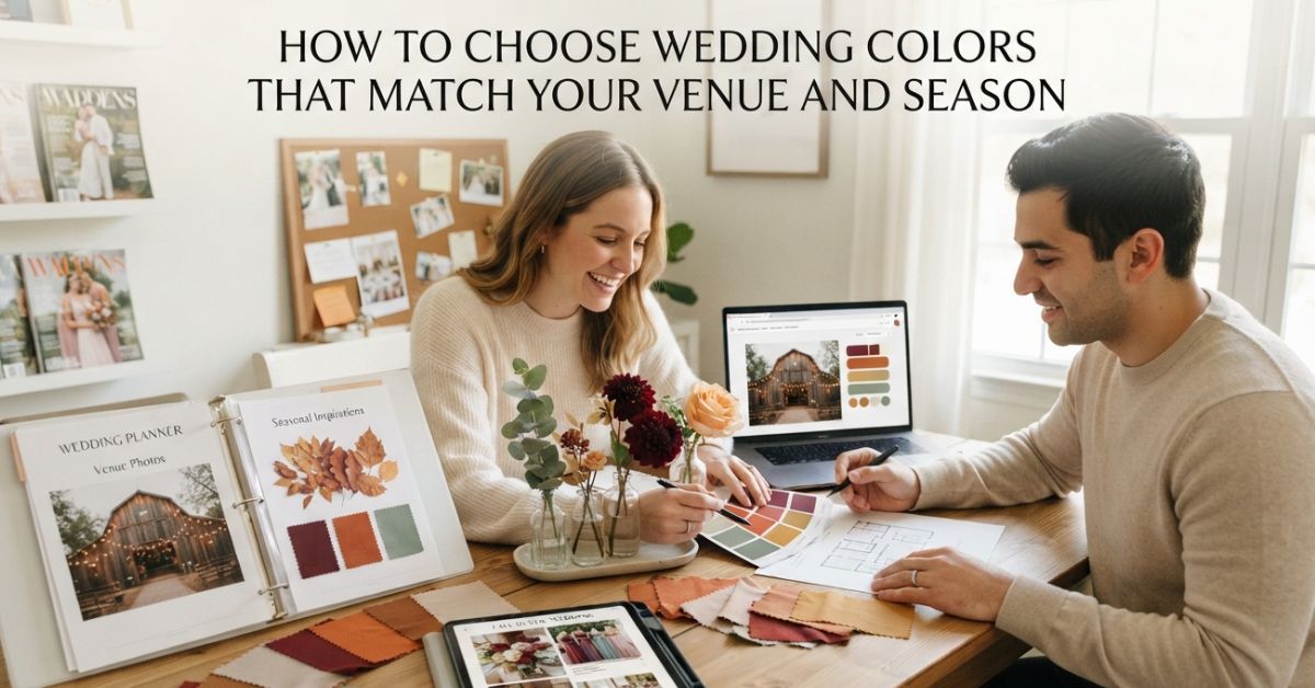
Around the time they reach their third Pinterest board, most couples eventually reach a hurdle. Every color palette looks stunning, but not one feels explicitly “correct.” The reason behind this paradox is that choosing wedding colors in isolation simply leads to ungrounded palettes, as it involves going from one inspiration board to another without taking into account the actual venue. The couples that end up with the best-looking palettes in photographs as well as in reality are those that allow the venue and season to make some of the choices for them.
Through this article, we provide a practical step-by-step method of choosing wedding colors. It covers techniques for discovering the color palette of the wedding site, how the season affects color choice, and how to get the best result.
Why Your Venue Should Shape Your Palette First
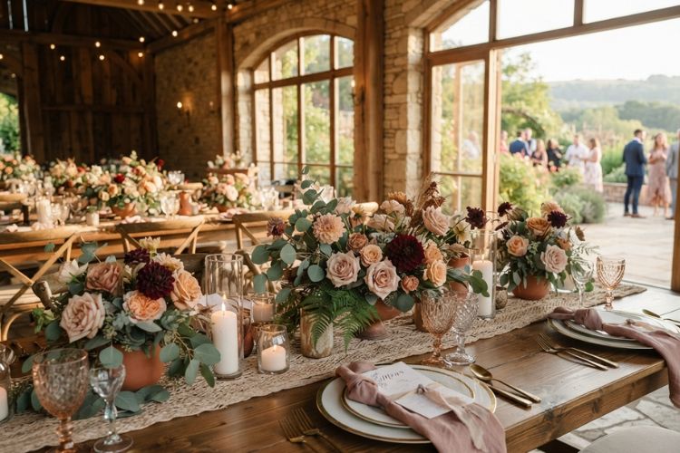
Each venue already has a story to tell prior to adding even just one bloom. Bricks exposed or dark wood beams, white plaster walls,s or marble floors- they’re all silently setting the mood, and a palette that doesn’t consider that groundwork is often somewhat out of sync with the space even though no one is able to explain the reasons.
Imagine your venue as the foundation layer, and your palette as the one you’re layering over the top. A barn that has warm wood tones is a great place to enjoy earthy, muted hues, while a light, airy ballroom with white walls offers more space to experiment with vivid colors since there’s a neutral backdrop under. Knowing how to select wedding colors begins with exploring the venue, usually during the time your wedding ceremony or reception will take place, and observing the existing decor prior to deciding what else you can include. This one step can be the distinction between colors that are a natural choice as opposed to colors that feel random.
How to Pick Wedding Colors Based on Your Specific Venue Type
Different venue types tend to reward different color approaches, and this is where how to choose wedding colors really comes down to specifics rather than general rules. Here’s a practical breakdown for how to pick wedding colors depending on where you’re getting married:
- Historic estates and mansions tend to hold deep, saturated shades well; think burgundy, forest green, or navy paired with gold or champagne accents that echo existing architectural detail.
- Modern industrial spaces with concrete, glass, or exposed steel often look best with a more restrained palette, monochromatic tones, or a single bold accent color against black and white.
- Outdoor garden or vineyard settings rarely need much color intervention at all; soft pastels or neutral tones let the natural greenery carry most of the visual weight.
- Coastal and waterfront venues pair naturally with breezy, sun-warmed tones; sandy neutrals, soft blues, and warm coral work with the setting rather than against it.
- Traditional ballrooms can support richer jewel tones and metallics, since the formality of the space matches a more dramatic color statement.
None of these are strict rules. They’re starting points that keep you from choosing colors for wedding decor that quietly compete with a room instead of complementing it, and they make how to pick wedding colors feel far less overwhelming once the venue has already ruled a few directions out.
Letting the Season Guide Your Colors for Wedding Day
When your location has narrowed your field and the time of year is the next factor to consider. Colors that are seasonal tend to appear natural since they reflect what’s happening out there, and that harmony is reflected in your images in a way that is difficult to replicate.
Weddings that are held in spring generally tend to have light, fresh tones. Pink, lilac, yellow, and sage can all appear light and optimistic against the backdrop of new development. The summer season opens up the possibility of greater choices, such as cobalt, coral, as well as warm sunshine, which stand up well against the long, bright summer days. The autumn season is when the warmer, richer shades come into play, while the deep gold and burned sienna are all at home against changing leaves. Winter is a time to go for cooler, more formal shades like navy, emerald, silver, and deep burgundy, which look gorgeous against barren branches or at a reception.
However, the colors of the season for wedding planning provide guidance but not the norm. A winter wedding centered around ivory and dusty roses could be breathtaking. A summer wedding in gold and deep navy is unique because it is a departure from the typical style. Take advantage of the season as a start and not as a constraint that you feel obligated to.
Finding the Best Colour Combination for Wedding Palettes
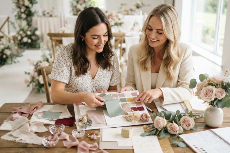
Most palettes that hold together well follow a simple structure: one anchor shade, two supporting tones, and one or two smaller accent colors. Working out the best colour combination for wedding decor gets much easier once you think in this framework rather than trying to pick five equally weighted colors at once.
Begin with your anchor color, the hue that shows the most frequently throughout linens, flowers, and other clothing. Next, select two shades that share the same warmth or coolness and make it feel as if it’s competing for attention. Add one or two accent colors for small details such as candles, ribbons, or even stationery trim; a more striking or more unusual color can provide depth, but without overpowering the overall style.
This structure also matters for a reason that’s easy to overlook: your palette isn’t just decor; it extends to what your wedding party wears, and mismatched undertones between your color scheme and your attendants’ outfits are one of the more common sources of inappropriate wedding attire on the day, clothing that technically fits the dress code but visually clashes with everything around it in photos. Landing on the best colour combination for wedding attire and decor together, rather than treating them as separate decisions, is what keeps the whole day looking unified.
Communicating Your Palette Clearly to Every Vendor
After you’ve decided on the colours, the next task is to ensure that everyone who’s building your wedding, including florists, the linen rental company, or the stationer, is using the same source. “Dusty rose” can mean several different shades based upon who you ask. So sharing swatches of actual colors or hex codes takes away the confusion and helps avoid last-minute mismatches.
This is the place where wedding planner responsibilities truly make their living. A big part of what coordinators do in the background is to keep each vendor on the same reference palette for a floral ivory, which is actually more cream-colored, or a linen sample which appears warmer than the color swatch, and then it manifests as a noticeable inconsistency on the day.
Frequently Asked Questions
How many colors should a wedding palette include?
Most successful palettes work with three to five colors, one anchor shade, a couple of complementary tones, and one or two accents, which keeps the overall look cohesive rather than scattered.
Should my wedding colors match my venue exactly?
They should complement the space rather than replicate it. A venue with warm wood tones doesn’t require an all-terracotta palette; softer neutrals with natural greenery can feel just as at home.
Can I choose a color palette that doesn’t match the season?
Yes. Seasonal palettes are a helpful starting point, not a requirement. A palette that breaks from the expected seasonal tones can look just as intentional if it’s built thoughtfully.
What’s the easiest way to avoid clashing colors in photos?
Share exact swatches or hex codes with every vendor, including whoever is coordinating attire, so nothing is left to interpretation between “close enough” shades.
Choosing wedding colors that genuinely fit your venue and season takes some of the guesswork out of the rest of your planning, and it’s exactly the kind of detail Wisteria Weddings & Events helps couples work through from the very first conversation. If you’d like a second set of eyes on your palette, reach out to Sharon to get started.